Trump's Tariffs Did Top US Stocks Really Take a Hit? Data Science will judge it
Take dives deep into the data, analyzing whether Trump's tariffs truly affected the performance of top US stocks or not based on data .
Ahmed Adel Eltahan
7/30/20259 min read

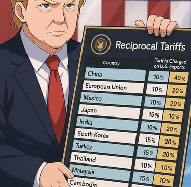
You've probably heard all the buzz about tariffs and trade wars, right? When the Trump administration rolled out those big policy changes, there was a lot of talk, and some real worry, about how it would hit the stock market, especially America's top companies. But here's the real question: did it actually play out that way?
We're diving straight into the hard numbers from market data to show you exactly how those leading US stocks truly performed under those trade policies. No speculation, just the facts revealed by the data
Introduction
Gathering all tools we need to start
To kick off our analysis, we first import the essential Python libraries: pandas for efficient data manipulation, yfinance to fetch our stock data, numpy for numerical calculations, and matplotlib for clear data visualization.
Tools ready! Next up, we just need to grab the actual stock data. We'll pick the top US companies we're interested in, then pull their past prices from the exact time those tariff rules were in play. That's our starting point for finding the answers.
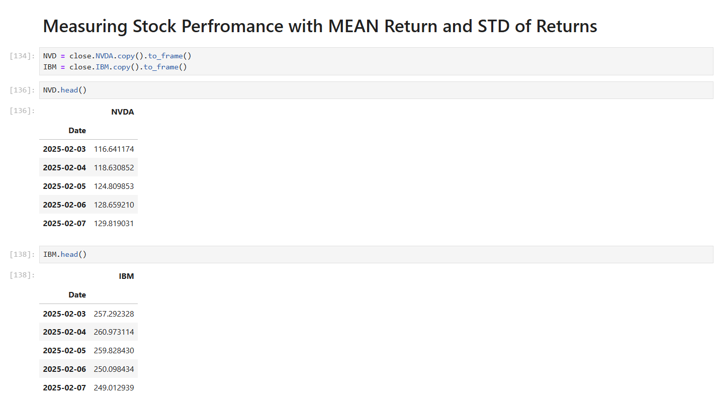
So, where do we begin? We've decided to kick things off by focusing on some of the most recognized and influential companies out there. We're talking about big names like NVIDIA (NVDA), Boeing (BA), Coca-Cola (KO), IBM, Disney (DIS), Microsoft (MSFT), and Amazon (AMZN).

With our chosen stocks in mind, our next move is to gather all their historical data. We'll pull everything from the very start of the tariff announcements right up to the current month. For this, we'll rely on the trusty yfinance library to get all the numbers we need for our analysis.
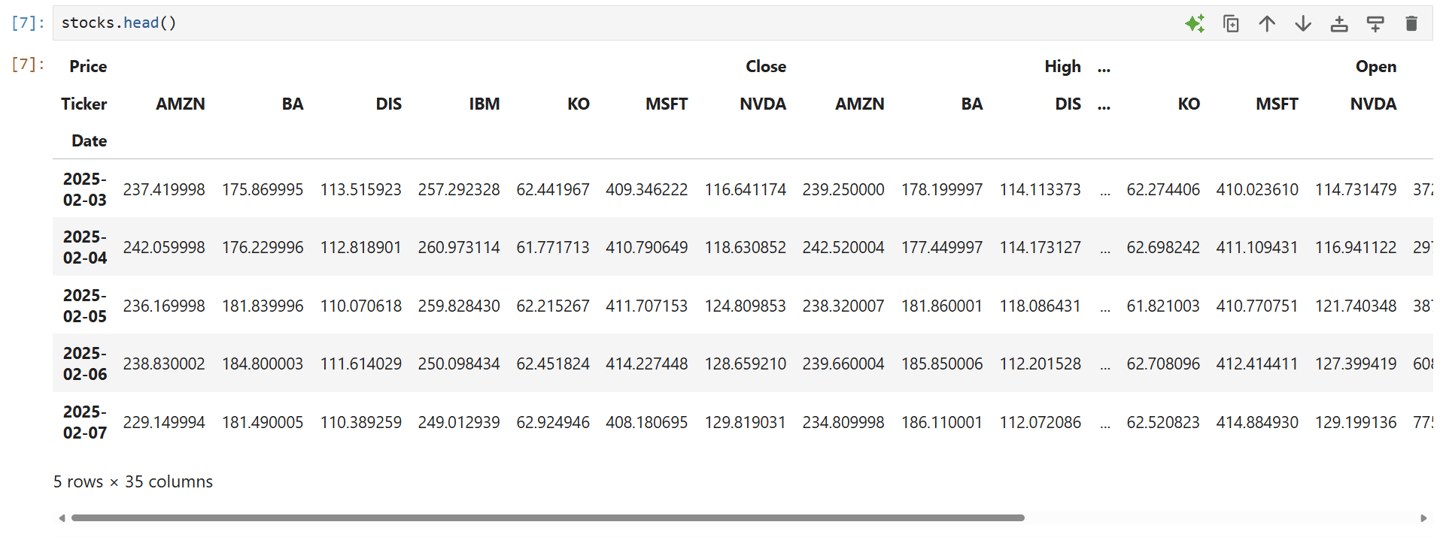
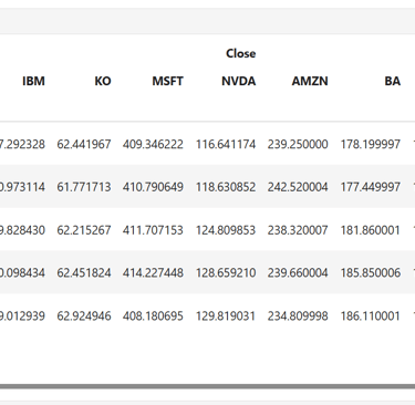
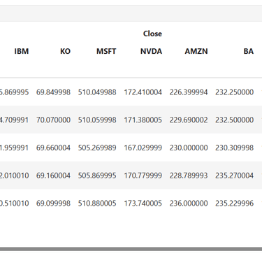
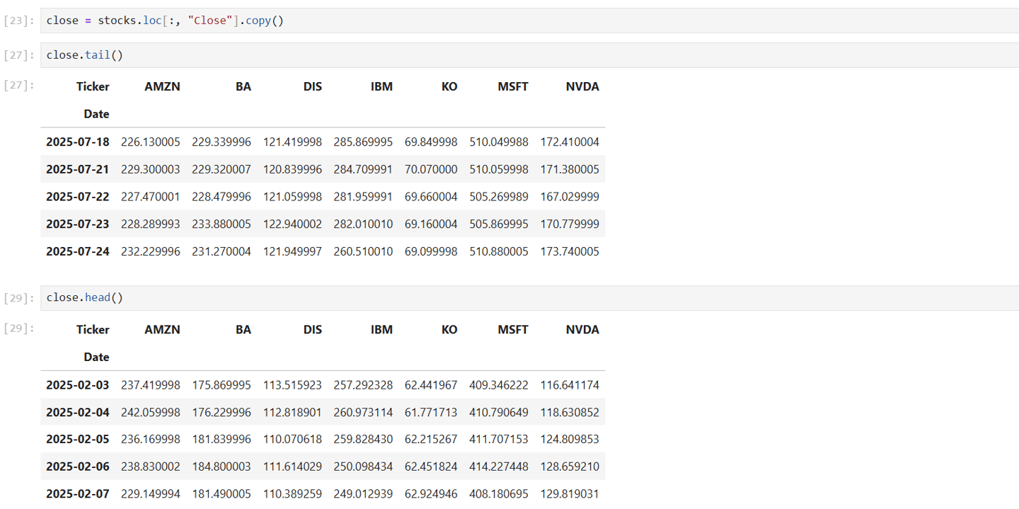
Alright, with all our data pulled, what's the first thing we do? We'll use the .head() method to take a quick look at the most recent stock values. It's like checking the top of the data pile to see how these stocks have been doing lately
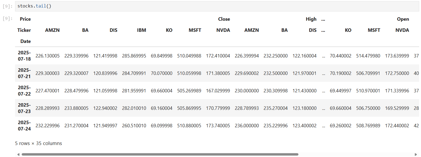
So, we've already checked the very start of our data using .head(). Now, to see how things wrapped up, we'll use the .tail() method. It lets us peek at the most recent stock values in our dataset, giving us a quick look at how their performance started in the period we're studying.
Okay, we've got all the stock data we need! To keep things tidy and make sure we can easily use it later, we'll save it all into a new CSV file. This step also gets our data organized and ready for the real analysis to begin
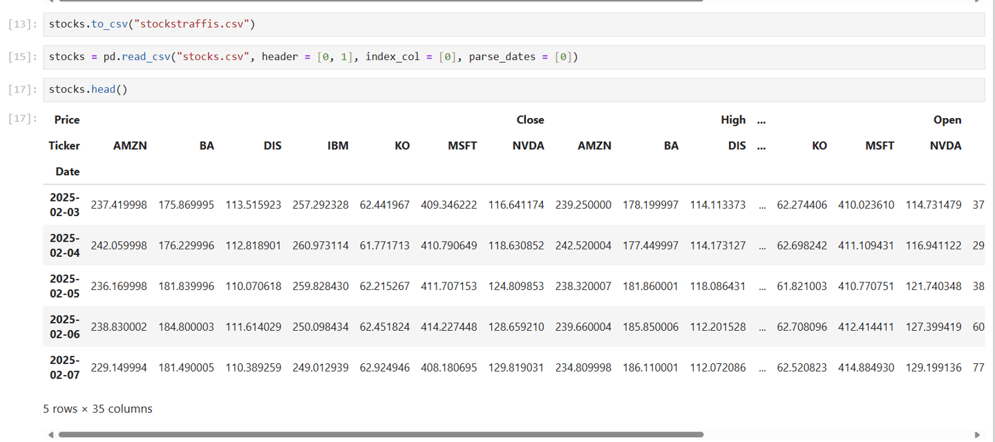
Lets start analysis
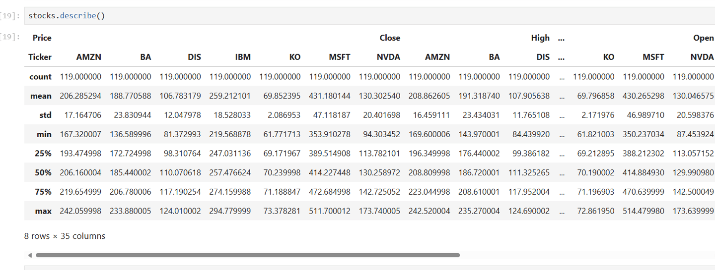
Alright, with our data ready, the first real look is usually with describe(). This gives us a quick summary of everything, covering 119 data points for each of our 35 different columns.
Let's check out what these summary numbers mean. The 'mean' tells us the average price for each stock over our analysis period. Then there's 'std' (standard deviation), which is crucial for stocks because it shows us how much the prices typically spread out or 'swing' around that average – basically, how volatile or 'risky' a stock's price movements usually are. Finally, the '25%', '50%', and '75%' values are like milestones. They tell us where 25%, 50% (the middle value, or median), and 75% of the daily prices fell within our dataset, giving us a quick sense of the typical range.
Looking at the 'Price' section, you can quickly spot some interesting differences. For instance, Coca-Cola (KO) has a relatively low average price ('mean') and a very small 'std', meaning its price usually sticks close to its average and doesn't swing much. Meanwhile, companies like Microsoft (MSFT) or NVIDIA (NVDA) show much higher average prices and bigger 'std' values, clearly indicating they tend to be far more volatile. This powerful summary helps us immediately grasp the general behavior of each stock's prices, whether it's their opening, closing, or highest values.
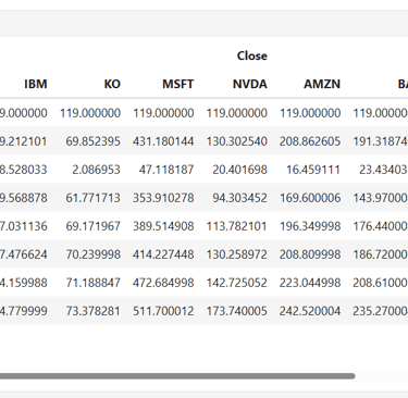
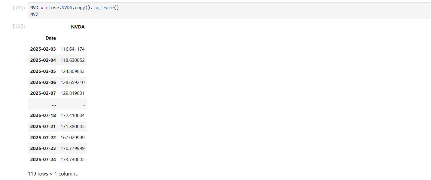
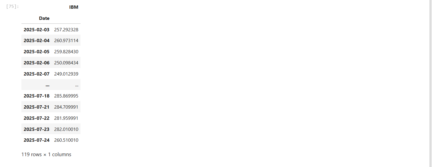
So, with that big summary in hand, let's zoom in on the daily closing price, as that's what really matters for our analysis. This 'Close' price is basically the final word on how a stock performed each day. So, we'll grab just these closing prices for all our stocks and put them neatly into their own dedicated dataset. This way, we have a clean slate to really dive into their performance trends.
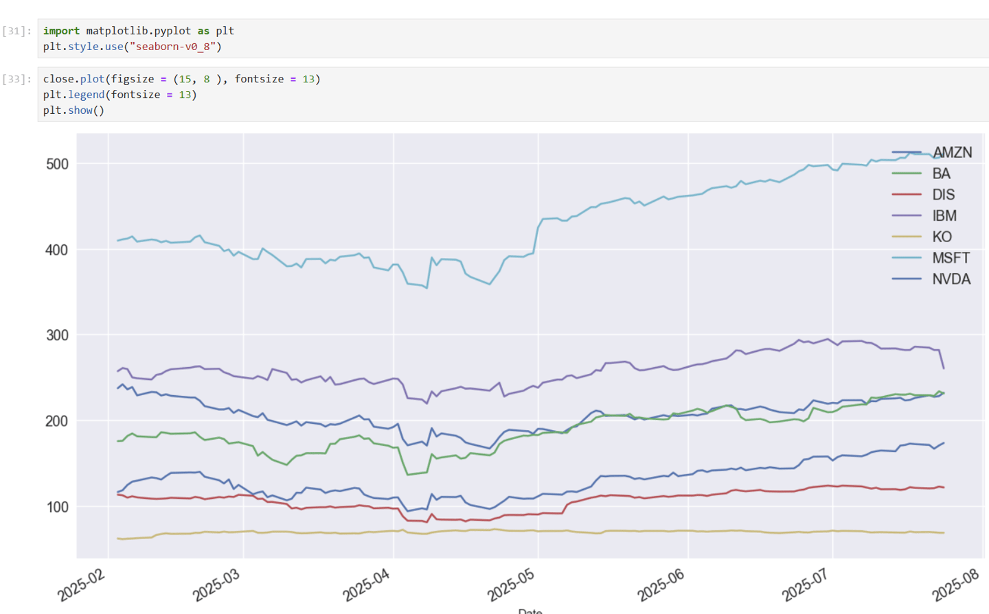
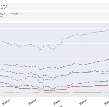
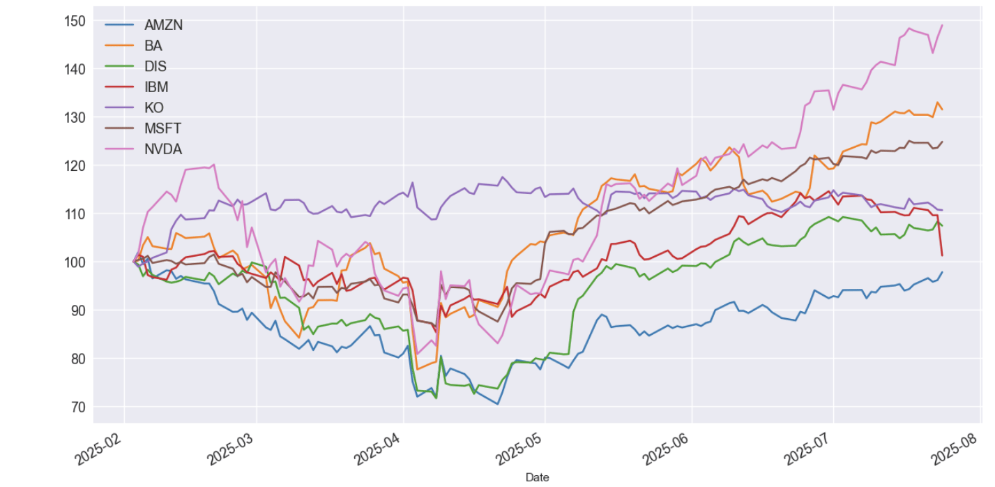
Time to get visual! With all those daily closing prices collected from February to July of this year (2025), it's time to bring them to life on a graph! This visual will let us quickly see who's been performing better and whose stock has been more stable or growing steadily.
Once we have that clear picture, we can pick out the top dog and the lowest performer. This way, we can really dig in and see if the tariffs truly affected them, or if their performance was more about internal management decisions or other company-specific factors.
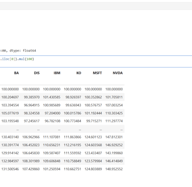
So, we'll now zoom in on how these stocks actually changed day-to-day. We'll calculate their daily percentage shifts to see their ups and downs more clearly. To really compare their growth from the same starting line, we'll imagine each stock began at 100 (or 100%), and then track how much they climbed (or fell!) from there.
This way, we can easily spot if they've shot up significantly and how much they gained compared to the previous day's close. It gives us a clearer picture of their everyday performance and helps us understand their risk.
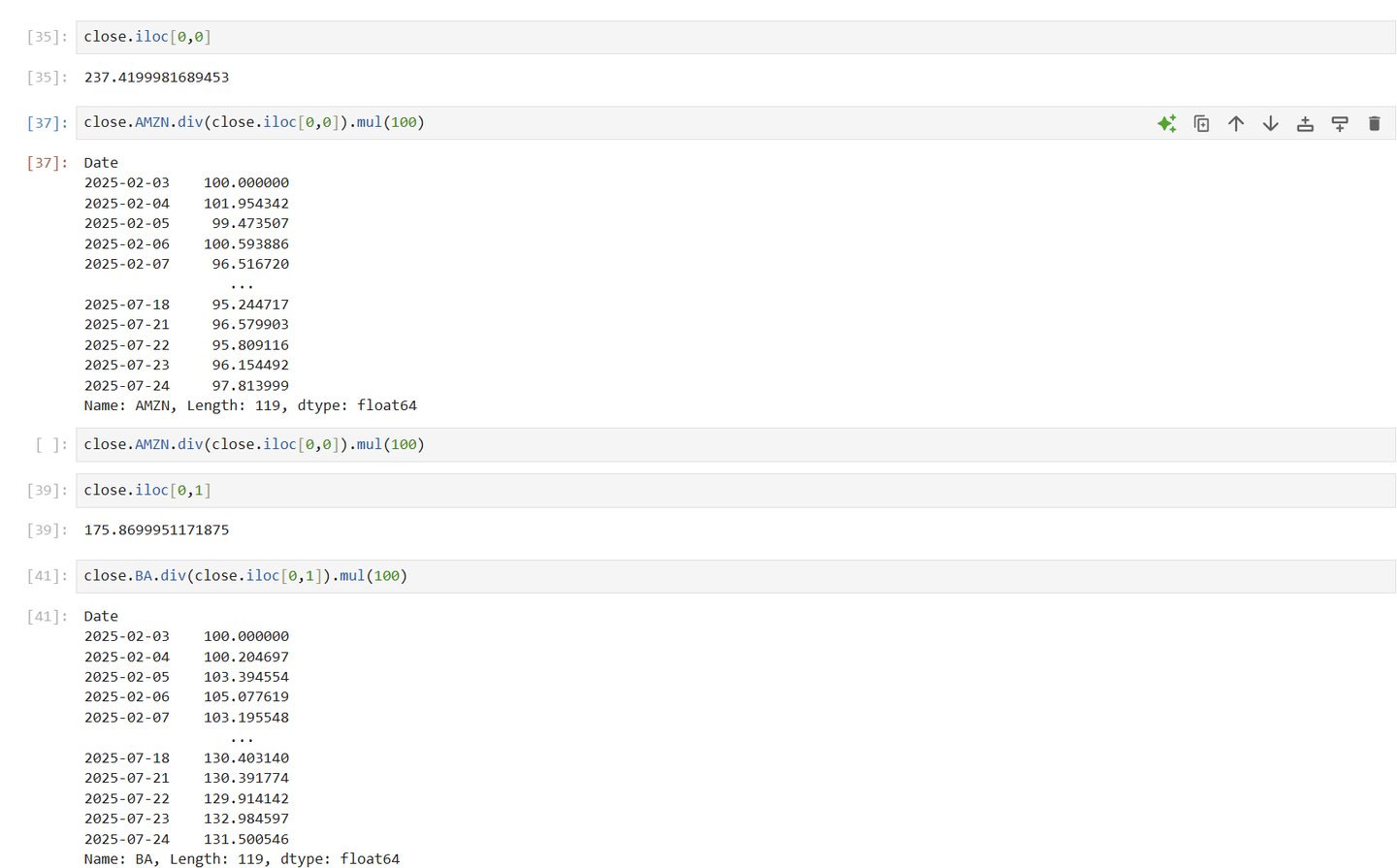
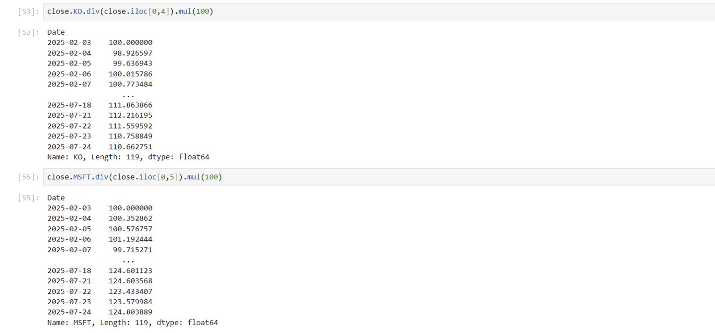
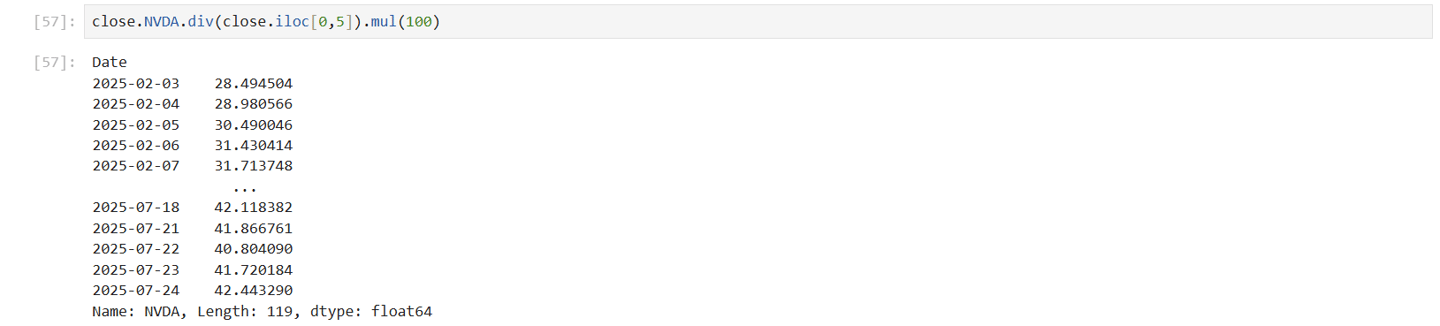

After seeing those day-to-day shifts, our next trick is to normalize the stock values. What this means is we'll imagine each stock's price at the very beginning of our analysis period started at 100.
Then, all its gains will show up as numbers above 100, and any losses will be below 100. This is super helpful because it lets us easily compare how much each stock has truly grown or shrunk relative to its own starting point, and against each other, even if their actual prices are very different
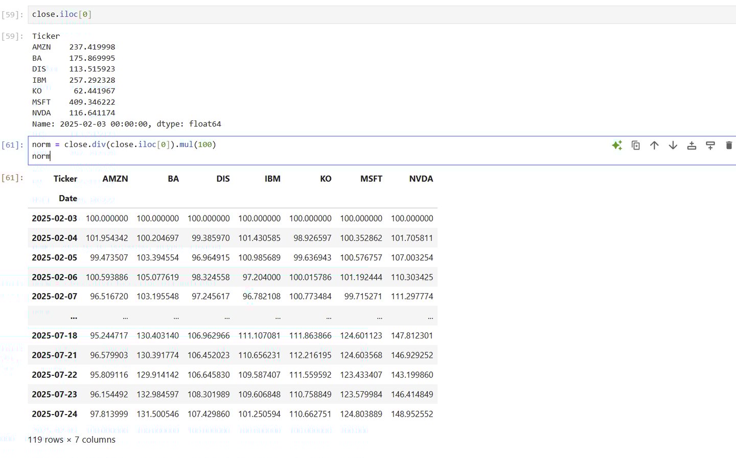
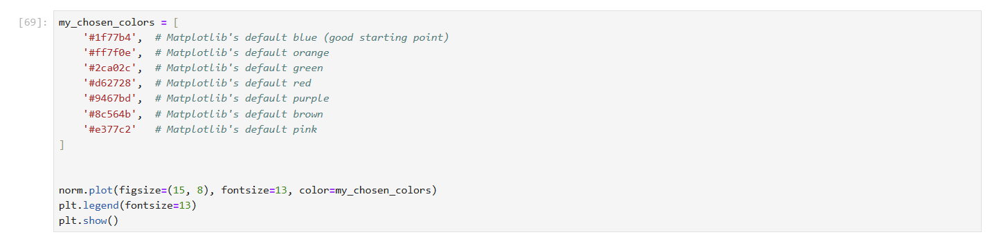
Now that we've got all those normalized values, it's time to plot them on a graph. This visual will make it super easy to see how each stock is truly performing – who's shooting up, who's staying steady, and who's lagging behind.
Alright, now that our graph has revealed the top and bottom performers, it's time for a deep dive into two specific players, like IBM and NVIDIA. For this deeper analysis, we'll focus on the daily closing values of each stock. We'll unpack what was really going on with their daily stock movements, and figure out the actual risk you'd be looking at if you invested in them.


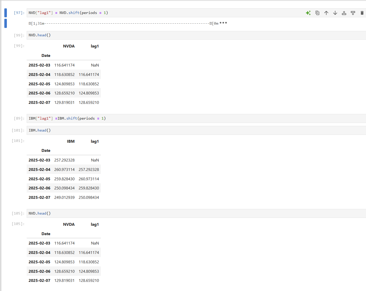
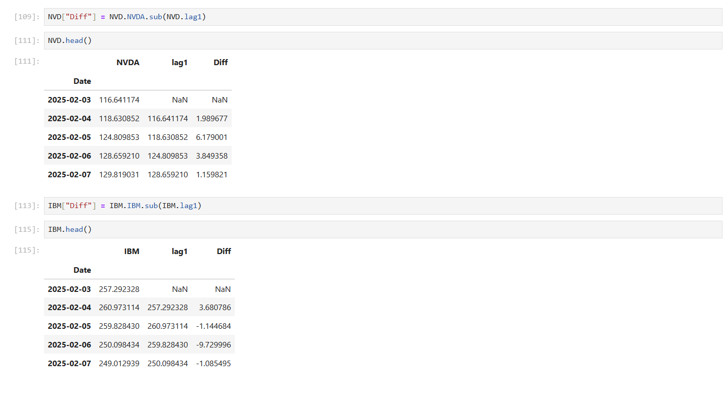
So, now that we have the daily closing values, our next step is to calculate the daily, and even monthly, gains and losses. For the daily changes, we'll first create what's called a 'lag' column and a 'Diff' column. This means we'll shift all the prices down by one spot, so each row in this new column holds the previous day's price. Then, we can simply subtract that previous value from the current day's value to clearly see every single gain and loss.
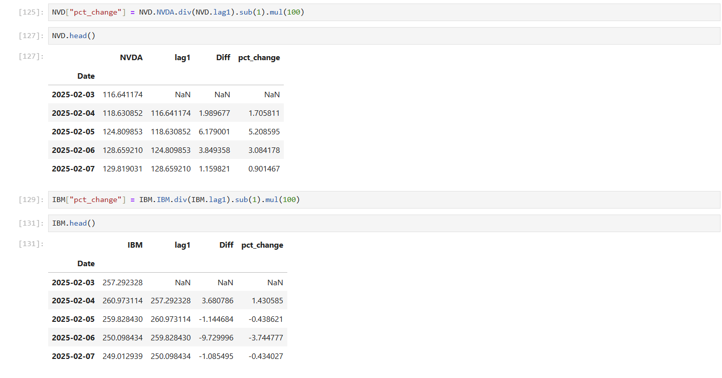
Then, now it's time to put that 'lag' column to good use! We'll calculate the period-over-period percentage change (what we often call daily or monthly returns in finance) for both NVIDIA's and IBM's stock prices. To do this, we simply take the current day's price, divide it by the previous day's price (from our lag column), subtract one, and then multiply by 100 to get our result as a clear percentage.
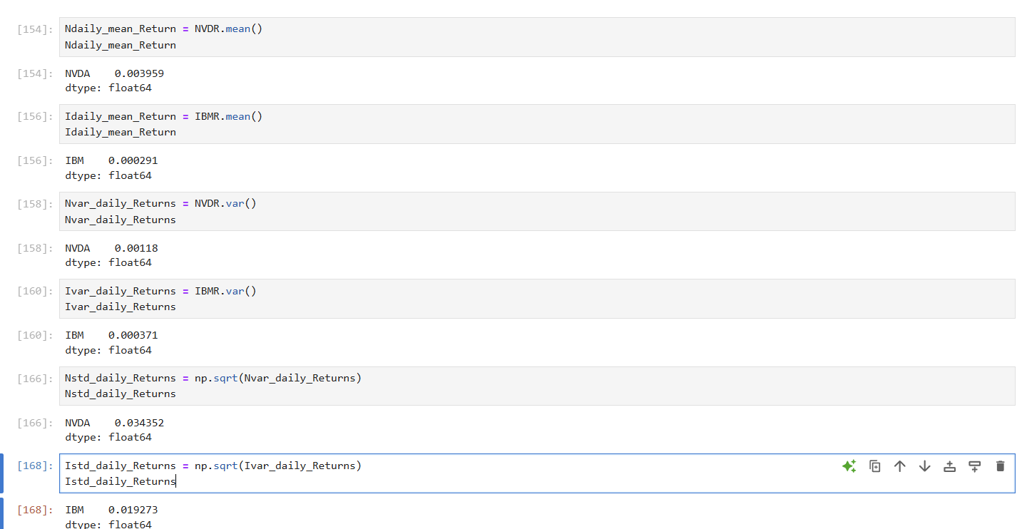
Now that we know how to get those percentage changes, let's actually calculate the daily returns for our stocks. Once we have those daily ups and downs, we'll zero in on two key numbers that tell us everything we need to know. The Mean Return will show us the average daily gain or loss – basically, 'what you gained on average' each day.
Meanwhile, the Standard Deviation (STD) of Returns is super important for understanding risk it tells us 'How wild the ride was' and how much those daily returns typically swung around that average (a bigger STD means more volatility, by the way!). Together, these two numbers give us awesome insights into how these stocks truly performed each day. We'll present these daily return calculations in a clear table, where you can easily see the performance for each stock alongside their respective dates.
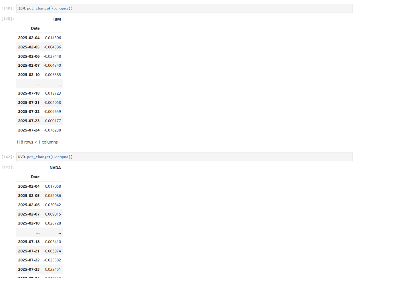
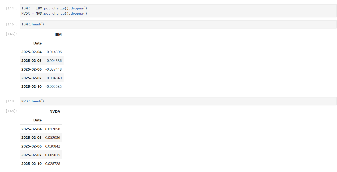
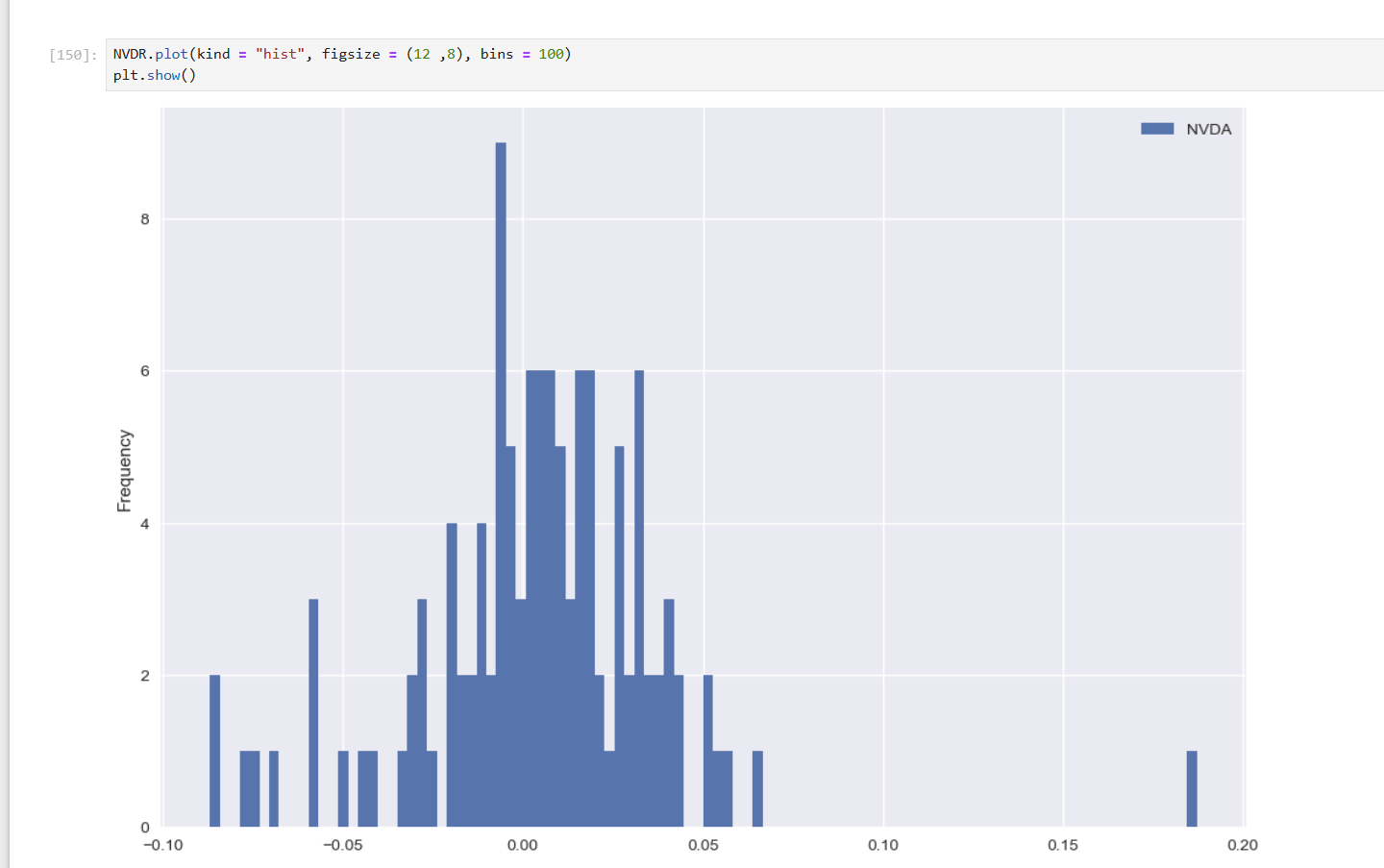
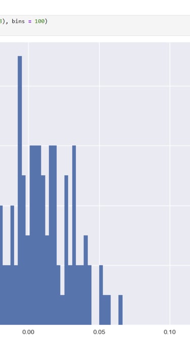
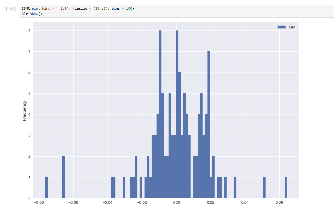
Okay, now it's time to actually calculate those daily percentage changes (or returns) in a super easy way! We'll use pandas' built-in .pct_change() method. This method automatically figures out the change from one period to the next for us. Since this often creates some missing data (called NaN values) at the very beginning, we'll quickly clean those up using .dropna(). After that, we'll put these clean daily returns into their own small table, perfectly ready for us to plot and visualize later on.

Now that we have all those daily percentage changes, let's plot them! Visualizing these changes will give us a much clearer picture of their daily ups and downs, helping us spot patterns and gain deeper insights into how each stock behaved.
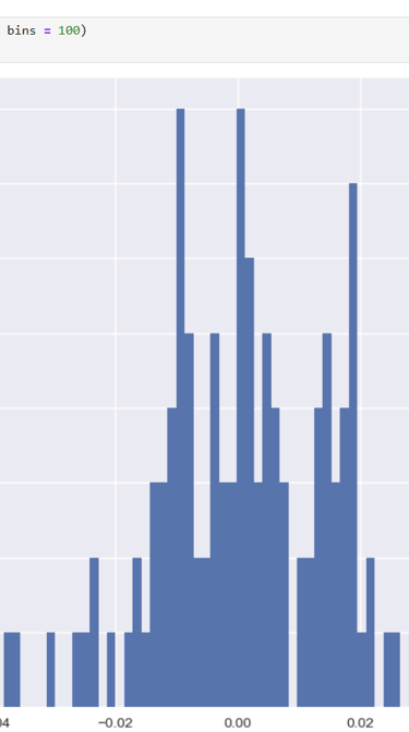
Okay, with all that data visualized, we're now in a great position to assess the historical performance of these stocks. This means we can truly understand the risks involved with each one, and directly compare them as potential investments. We'll get a clear picture of what kind of 'ride' each stock offers.
Looking closer at NVIDIA versus IBM, we can see the numbers tell a pretty clear story. NVIDIA, for instance, had a significantly higher average daily return of 0.3959% compared to IBM's 0.0291%. So, on average, NVDA was definitely more profitable each day during this period. But, there's a trade-off: NVIDIA also had a much higher daily standard deviation of 3.4352% against IBM's 1.9273%. This means NVIDIA's stock price experienced far larger daily swings—it was a much wilder and riskier ride!
In essence, during this time frame, NVIDIA offered a sweeter average daily return, but it definitely came with significantly higher daily risk (volatility) compared to IBM, which was a steadier, albeit less profitable, option.
Alright, as we wrap up our analysis of the highest and lowest performing stocks, the numbers tell us a very interesting story about the Trump tariffs. What we found is that, ultimately, both NVIDIA (our high-flyer) and IBM (our lower performer) didn't seem to be directly and significantly affected by the tariffs during this specific period, even through their ups and downs. Of course, if those tariffs had been fully unleashed at maximum force, the story might have been very different!
Instead, NVIDIA's impressive gains during this time were mostly driven by the booming demand for their AI chips and cards. This strong core business allowed them to thrive even during times of geopolitical tension. On the flip side, IBM's struggles and losses seemed to stem more from their own internal organizational challenges rather than tariff pressures.
However, it's crucial to remember that while NVIDIA performed incredibly well, it does hold a very significant risk if it were to lose access to the Chinese market in the future. Ultimately, in the dynamic world of stocks, even the most thorough past analysis can sometimes be made 'meaningless' by unforeseen future events.
Thanks so much for sticking with us till the very end and reading through this deep dive!